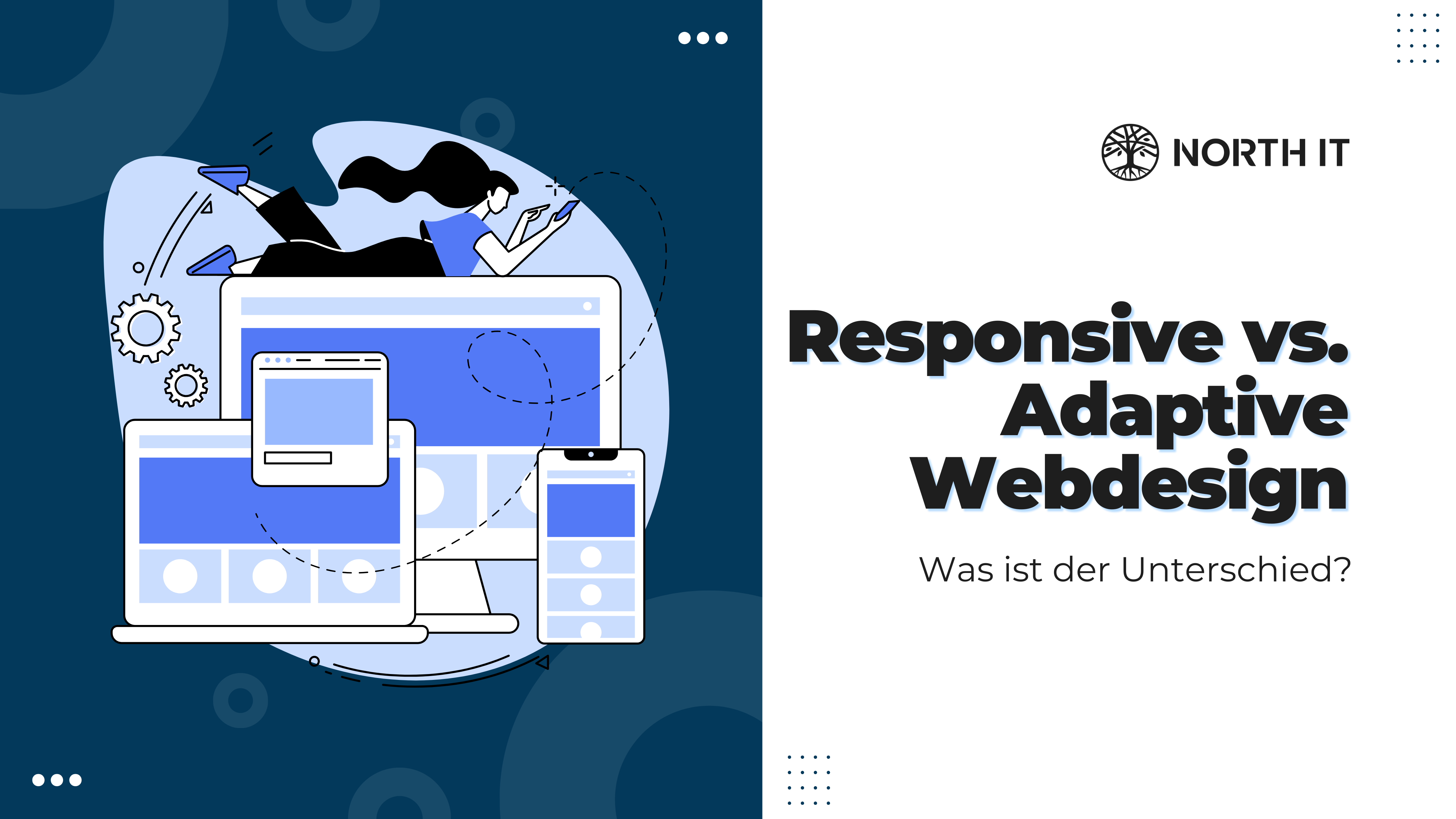
Responsive vs. adaptive web design: what's the difference?
In the digital age, a website is often the first point of contact between a company and its customers. It is therefore crucial that web designs function optimally on different devices. North IT Group GmbH, your digital agency in Leipzig, guides you through the world of effective web design and highlights the differences as well as the advantages and disadvantages of responsive and adaptive design.
What you need to know
- Responsive web design adapts flexibly to any screen size.
- Adaptive web design creates specific layouts for different devices.
- The choice depends on the target group, performance and design philosophy.
- An effective web design takes into account user experience and loading speed.
- As a digital agency in Leipzig, North IT Group GmbH offers customized solutions.
Responsive web design
Responsive design, a key term for effective web design, uses a flexible layout that dynamically adapts to the size of the viewing screen. It is based on relative units such as percentages and flexible images so that the website always looks and functions optimally on a desktop, tablet or smartphone. A major advantage of responsive design is that it is less maintenance-intensive than adaptive design.
Adaptive web design
In contrast, adaptive design creates specific versions of a website for different device sizes. Based on the recognized dimensions of the device, the website loads a pre-designed layout. This can improve the loading speed, as only the elements relevant to the respective device are loaded. However, the maintenance effort for the different versions can be higher.
Responsive vs. adaptive design: what's the difference?
The main difference between responsive and adaptive design lies in the approach to resizing. Responsive design flows and scales with the screen size, whereas adaptive design is designed for specific screen sizes and breaks when these sizes are reached. Responsive design uses breakpoints to control layout changes, whereas adaptive design loads a new layout at certain points.
How to decide between responsive and adaptive design
The decision between responsive and adaptive design should be based on a thorough analysis of your target audience and their usage behavior. Consider which devices your target group uses most often and how your content is best presented on them. Budget, maintenance costs and long-term digital strategy are also important factors. North IT Group GmbH in Leipzig will be happy to help you with this decision and offer you a customized solution.
How you can tell whether a website is responsive or adaptive
To recognize whether a website is responsive or adaptive, you can change the size of your browser window and observe how the layout of the page adapts. With a responsive design, you will see that elements rearrange themselves smoothly, whereas with an adaptive design, the layout breaks at certain points and may change completely.
What can we do for you?
North IT Group GmbH is your contact for high-quality web design in Leipzig. We understand that every business is unique and offer customized web design solutions that are tailored to your specific needs. Our team of experienced designers and developers use the latest technologies and best practices to ensure that your website not only looks good, but is also functional, user-friendly and optimized for search engines.
- Customized web design that strengthens your brand
- Responsive and adaptive designs for optimal user experience
- SEO-optimized websites for better visibility and reach
- Strategic advice on choosing the ideal web design solution
Whether you choose responsive or adaptive design, we'll support you every step of the way. Contact us today to find out how we can help your business create an impressive online presence!
Image source: North IT Group